Videoland platforms
Videoland
platforms
Videoland platforms
Date
Sep 2018 -
May 2021
Role
Product
designer
Team
Apps, Growth, Onboarding
Background
Product background
My time at Videoland
Project take aways
App redesign
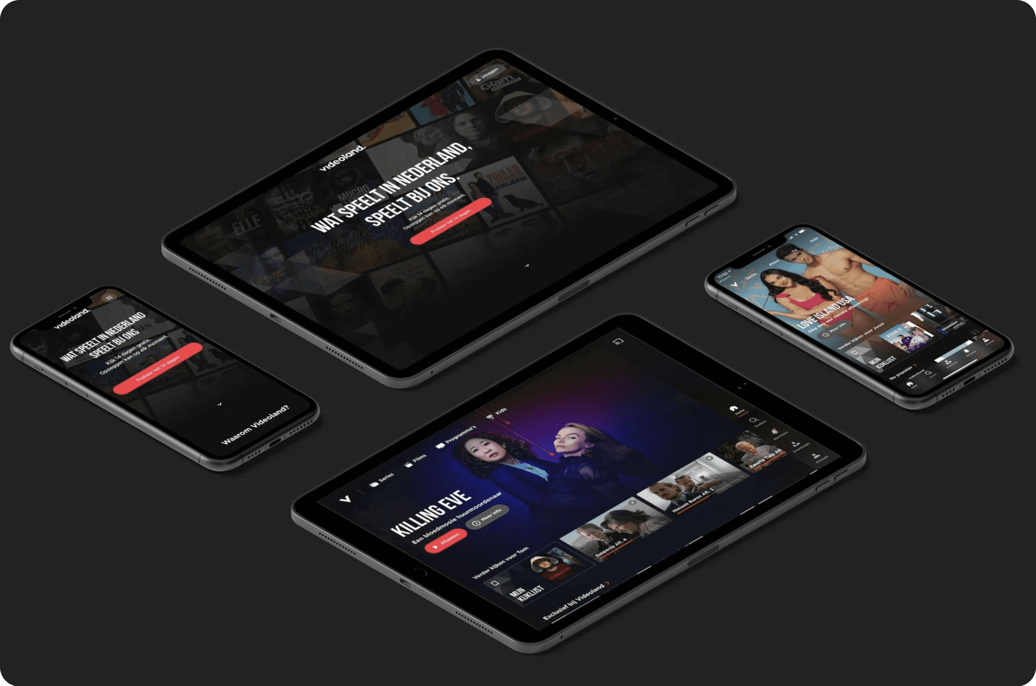
In September of 2018 I joined the Videoland Apps team at RTL Nederland, to work on the applications for iOS, Android, tvOS, Android TV and SmartTV. I was assigned to work on the visual and interaction design of various user stories.
I worked closely with two other UX designers, PO, tester, UX researcher and several developers. For the design we worked with a component library that contained the main design elements that the app consists out of - looseley based on the Atomic Design philosophy. Using Sketch and Principle we designed and prototyped new interface elements and interactions and using Zeplin we handed them off to the developers. We worked in Scrum and used Jira for project management.
During my time on the app team, among other things, a big project was the restructuring of the main navigation elements in the mobile apps. For this, we worked together closely with the UX Researcher on the team.
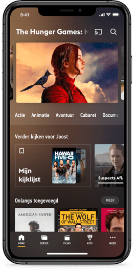
Old
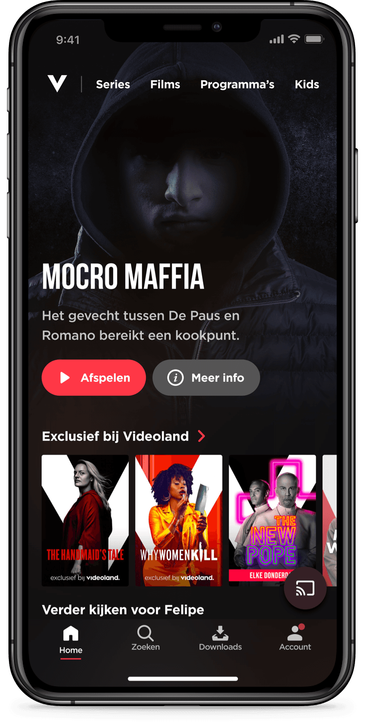
New

Old

New
Landing pages
After half a year on the Apps team, I joined the team working on onboarding and landing pages as the main designer. The landing pages are the pages that prospect customers land on before they subscribe (through the onboarding flow) for the product. The main landing page, videoland.com, has an average of ~ 1 milion unique visitors per month.
After working on various A/B tests to incrementally improve this page, in October 2019 together with our Lead CRO Lucas Vos, I set up a project to drastically redesign videoland.com.
The goal was to create a page that aligns better with the needs and wants of prospect customers, designed in a mobile-first manner with short copy that conveys the message and speaks to the target audience.
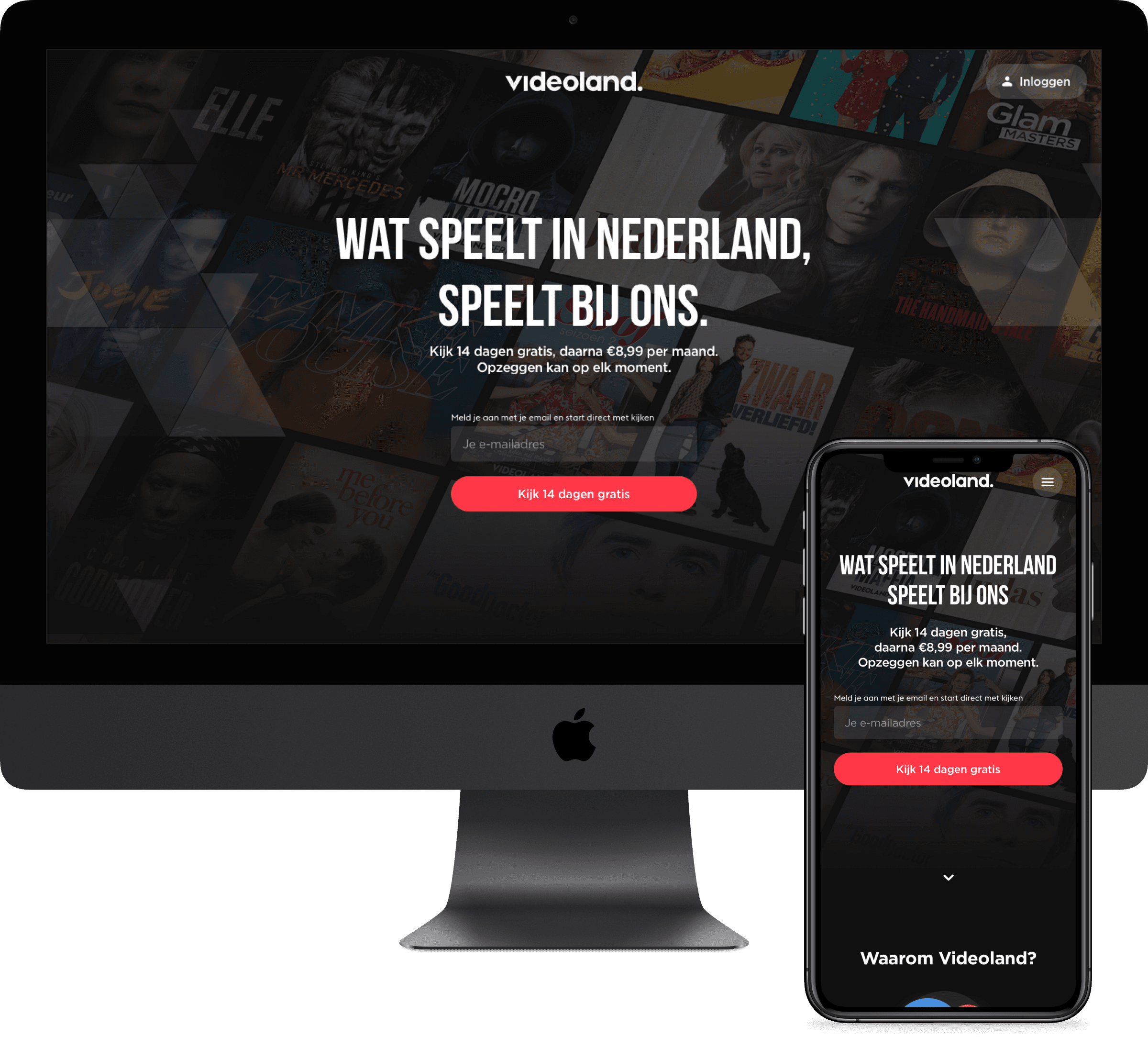
In April 2020, we launched the new landing page. I wrote an article on the process and learnings of co-creating, prioritizing, designing, optimizing and testing this page.
Rebranding
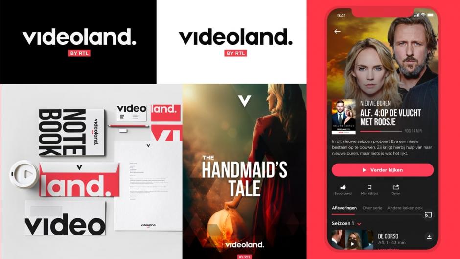
In August of 2019 a project was launched at Videoland to rebrand the product. At the time, there wasn't a very clear visual language and coherent style (there were several different primary colors floating around, that were isolated from old designs and logos) which did not make for a strong brand and consistent experience across platforms. We worked together with branding agency Dentsu (then Achtung McGarryBowen) to create a new visual identity. I was involved with the development of the style along with the other designers at Videoland.
After the branding was final, the work came of implementing it in a consistent way into the product. Key here was consistency across different channels, from apps and web to smart TV and marketing materials. I was mostly involved in creating the designs and guiding and overseeing the implementation for the web touchpoints, inlcuding the landing pages, onboarding and web platform.
Subscription tiers
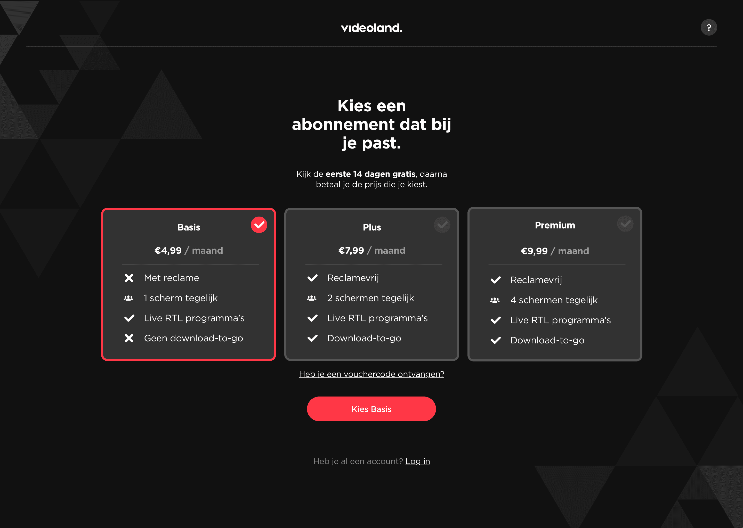
In the summer of 2020 there were advanced plans at Videoland to introduce three different subscription tiers, which provide different features for different prices. I helped define the names of the tiers, which eventually became Basis (Dutch for "basic"), Plus, and Premium. After establishing the features I worked on wireframing and designing the flow and the UI elements that guide the user through selecting a tier that fits the best for them, having all the information and being able to make their descision before they fully onboard.
Another important part of introducing these different subscription tiers occurs lateron in the customer journey. Namely, the possibility for the customer to switch tiers at any point in their billing cycle, providing a supporting interface that shows them exactly how and when their changes will affect their experience and billing. In order to make sure this was clear enough to the user I worked on mapping out the flows, creating interactive prototypes, testing these with users and iterating UI elements and copy based on the findings.
Design system

Since the day that I started working full-time at Videoland, I set up a project to create a unified design system for web. Along with this I've worked on introducing design versioning and developer handoff using Abstract.
This made for a single source of truth, better collaboration on designs and more transparency about what is being worked on. Next to master files, component libraries and branches in Abstract, I created an accompanying style guide in ZeroHeight. This way, our design principles and rationale behind components, elements and styles is more clear and can easily be communicated.
Thanks for taking the time to read.
I hope this case study gave you some insight in my process and ways of thinking.
Date
Sep 2018 -
May 2021
Role
Product
designer
Team
Apps, Growth,
Onboarding
Background
Product background
My time at Videoland
Project take aways
App redesign
In September of 2018 I joined the Videoland Apps team at RTL Nederland, to work on the applications for iOS, Android, tvOS, Android TV and SmartTV. I was assigned to work on the visual and interaction design of various user stories.

I worked closely with two other UX designers, PO, tester, UX researcher and several developers. For the design we worked with a component library that contained the main design elements that the app consists out of - looseley based on the Atomic Design philosophy. Using Sketch and Principle we designed and prototyped new interface elements and interactions and using Zeplin we handed them off to the developers. We worked in Scrum and used Jira for project management.
During my time on the app team, among other things, a big project was the restructuring of the main navigation elements in the mobile apps. For this, we worked together closely with the UX Researcher on the team.

Old

New

Old

New
Landing pages
After half a year on the Apps team, I joined the team working on onboarding and landing pages as the main designer. The landing pages are the pages that prospect customers land on before they subscribe (through the onboarding flow) for the product. The main landing page, videoland.com, has an average of ~ 1 milion unique visitors per month.
After working on various A/B tests to incrementally improve this page, in October 2019 together with our Lead CRO Lucas Vos, I set up a project to drastically redesign videoland.com.
The goal was to create a page that aligns better with the needs and wants of prospect customers, designed in a mobile-first manner with short copy that conveys the message and speaks to the target audience.

In April 2020, we launched the new landing page. I wrote an article on the process and learnings of co-creating, prioritizing, designing, optimizing and testing this page.
Rebranding

In August of 2019 a project was launched at Videoland to rebrand the product. At the time, there wasn't a very clear visual language and coherent style (there were several different primary colors floating around, that were isolated from old designs and logos) which did not make for a strong brand and consistent experience across platforms. We worked together with branding agency Dentsu (then Achtung McGarryBowen) to create a new visual identity. I was involved with the development of the style along with the other designers at Videoland.
After the branding was final, the work came of implementing it in a consistent way into the product. Key here was consistency across different channels, from apps and web to smart TV and marketing materials. I was mostly involved in creating the designs and guiding and overseeing the implementation for the web touchpoints, inlcuding the landing pages, onboarding and web platform.
Subscription tiers

In the summer of 2020 there were advanced plans at Videoland to introduce three different subscription tiers, which provide different features for different prices. I helped define the names of the tiers, which eventually became Basis (Dutch for "basic"), Plus, and Premium. After establishing the features I worked on wireframing and designing the flow and the UI elements that guide the user through selecting a tier that fits the best for them, having all the information and being able to make their descision before they fully onboard.
Another important part of introducing these different subscription tiers occurs lateron in the customer journey. Namely, the possibility for the customer to switch tiers at any point in their billing cycle, providing a supporting interface that shows them exactly how and when their changes will affect their experience and billing. In order to make sure this was clear enough to the user I worked on mapping out the flows, creating interactive prototypes, testing these with users and iterating UI elements and copy based on the findings.
Design system

Since the day that I started working full-time at Videoland, I set up a project to create a unified design system for web. Along with this I've worked on introducing design versioning and developer handoff using Abstract.
This made for a single source of truth, better collaboration on designs and more transparency about what is being worked on. Next to master files, component libraries and branches in Abstract, I created an accompanying style guide in ZeroHeight. This way, our design principles and rationale behind components, elements and styles is more clear and can easily be communicated.
Thanks for taking
the time to read.
I hope this case study gave you some insight in my process and ways of thinking.
Date
Sep 2018 -
May 2021
Role
Product
designer
Team
Apps, Growth, Onboarding
Background
Product background
My time at Videoland
Project take aways
App redesign
In September of 2018 I joined the Videoland Apps team at RTL Nederland, to work on the applications for iOS, Android, tvOS, Android TV and SmartTV. I was assigned to work on the visual and interaction design of various user stories.

I worked closely with two other UX designers, PO, tester, UX researcher and several developers. For the design we worked with a component library that contained the main design elements that the app consists out of - looseley based on the Atomic Design philosophy. Using Sketch and Principle we designed and prototyped new interface elements and interactions and using Zeplin we handed them off to the developers. We worked in Scrum and used Jira for project management.
During my time on the app team, among other things, a big project was the restructuring of the main navigation elements in the mobile apps. For this, we worked together closely with the UX Researcher on the team.

Old

New

Old

New
Landing pages
After half a year on the Apps team, I joined the team working on onboarding and landing pages as the main designer. The landing pages are the pages that prospect customers land on before they subscribe (through the onboarding flow) for the product. The main landing page, videoland.com, has an average of ~ 1 milion unique visitors per month.
After working on various A/B tests to incrementally improve this page, in October 2019 together with our Lead CRO Lucas Vos, I set up a project to drastically redesign videoland.com.
The goal was to create a page that aligns better with the needs and wants of prospect customers, designed in a mobile-first manner with short copy that conveys the message and speaks to the target audience.

In April 2020, we launched the new landing page. I wrote an article on the process and learnings of co-creating, prioritizing, designing, optimizing and testing this page.
Rebranding

In August of 2019 a project was launched at Videoland to rebrand the product. At the time, there wasn't a very clear visual language and coherent style (there were several different primary colors floating around, that were isolated from old designs and logos) which did not make for a strong brand and consistent experience across platforms. We worked together with branding agency Dentsu (then Achtung McGarryBowen) to create a new visual identity. I was involved with the development of the style along with the other designers at Videoland.
After the branding was final, the work came of implementing it in a consistent way into the product. Key here was consistency across different channels, from apps and web to smart TV and marketing materials. I was mostly involved in creating the designs and guiding and overseeing the implementation for the web touchpoints, inlcuding the landing pages, onboarding and web platform.
Subscription tiers

In the summer of 2020 there were advanced plans at Videoland to introduce three different subscription tiers, which provide different features for different prices. I helped define the names of the tiers, which eventually became Basis (Dutch for "basic"), Plus, and Premium. After establishing the features I worked on wireframing and designing the flow and the UI elements that guide the user through selecting a tier that fits the best for them, having all the information and being able to make their descision before they fully onboard.
Another important part of introducing these different subscription tiers occurs lateron in the customer journey. Namely, the possibility for the customer to switch tiers at any point in their billing cycle, providing a supporting interface that shows them exactly how and when their changes will affect their experience and billing. In order to make sure this was clear enough to the user I worked on mapping out the flows, creating interactive prototypes, testing these with users and iterating UI elements and copy based on the findings.
Design system

Since the day that I started working full-time at Videoland, I set up a project to create a unified design system for web. Along with this I've worked on introducing design versioning and developer handoff using Abstract.
This made for a single source of truth, better collaboration on designs and more transparency about what is being worked on. Next to master files, component libraries and branches in Abstract, I created an accompanying style guide in ZeroHeight. This way, our design principles and rationale behind components, elements and styles is more clear and can easily be communicated.
Thanks for taking the time to read.
I hope this case study gave you some insight in my process and ways of thinking.
