Date
Feb - Jun
2018
Role
Research, design
Supervisors
Lex Koetzier Allard Roeterink
Background
Product background
Project take aways
Process

I started by defining a planning and strategy, evaluating the methods and tools I wanted to use during this project.
Devided into 4 different stages, namely "Introduction/Defining", "Research", "Concepting", "Designing" and "Testing & Validating" (as a parallel project stage).
I further subdevided these stages to differentiate, for example, between desk and field research.
Creating a planning in this way was a great way to start thinking about the way I wanted to tackle this project and what tools I was going to use at what stages in my project.
I used Trello as a tool to create an interactive version of the planning including deadlines and attachments, with color coding to keep track of the planning.

In the first stage of the project there was a lot of brainstorming and defining the scope of the project — how to create a well-functioning prototype from the abstract idea of making people more mindfull for their surroundings through digital photography? This is defined in the Design Challenge:
"How can we, using digital photography as a medium, make the user look at their surroundings more consciously, to create a moment of mindfulness?"
At the same time it was important to at this stage of the project to map out relevant stakeholders and set up a Statement of Requirements.
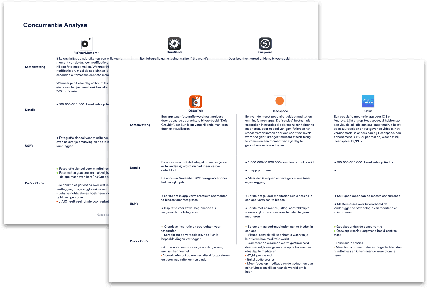
Also mapping out the apps that were already out there in a Competitor Analysis was part of this research stage.
In the next stage of the project I started setting up a test and interviewing some potential users over the internet. With the information gathered from these interviews I created several Personae, model users with specific needs and wants.
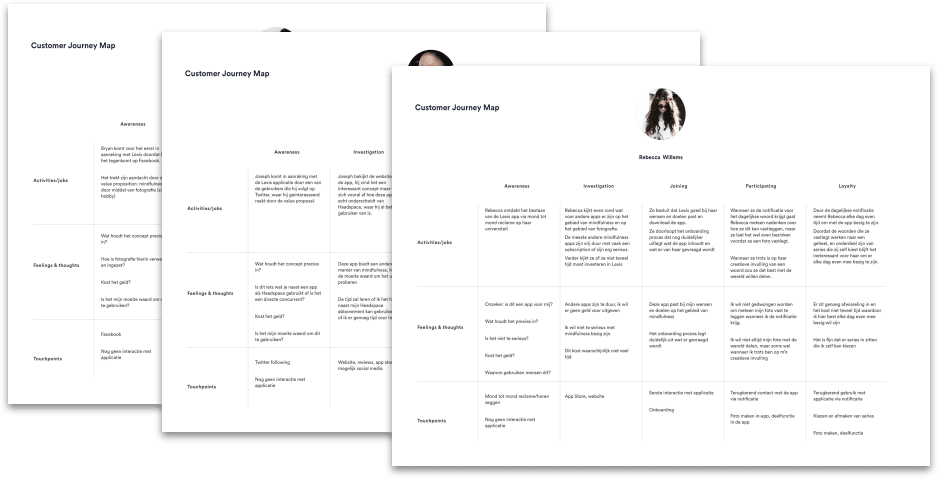
To gain a deeper understanding of what could motivate users for the use of this application I created Empathy Maps per Persona, to map out the things they hear, see and think regarding the context of this app. The Empathy Maps were then used to base the Customer Journeys on; the way users are likely to come in contact with - and use the app.
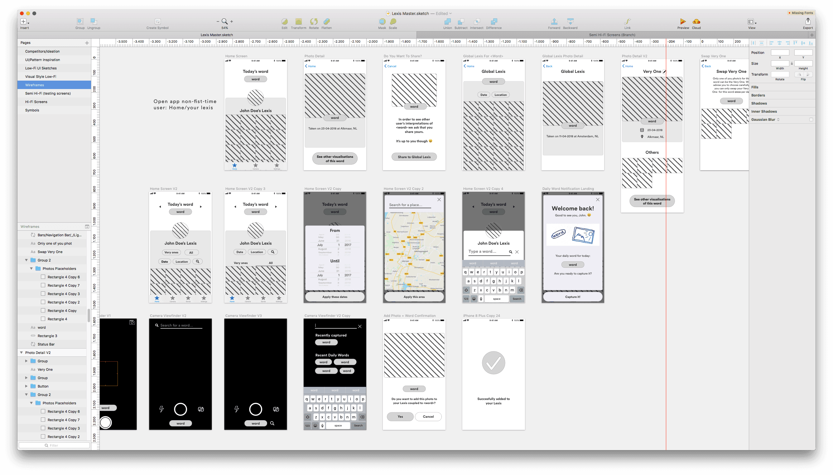
After gaining some deeper insights into what drives the user and gaining more empathy and understanding of their way of possibly interacting with the app, I started sketching out wireframes on paper, that I quite quickly moved into digitally into Sketch to create a functional prototype.
Moving quickly to this prototype was very important, because it allowed me to start testing with users in the target group and see how they experience the concept, as well as test the usability of the interface.
After testing this with users in the User Test Lab at the Amsterdam University of Applied Sciences, there was the possibility to quickly iterate based on learnings from this session.
The most important points were how the onboarding was interperted and whehter people understood the concept, where improvements could be made to make it more clear.
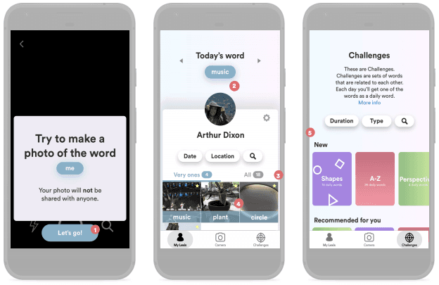
I took these learnings into consideration when designing the hi-fi prototype of the next step, that would also allow to test the visual style and branding of the app.
Thanks for taking the time to read.
I hope this case study gave you some insight in my process and ways of thinking.
Date
Feb - Jun
2018
Role
Research, design
Supervisors
Lex Koetzier Allard Roeterink
Background
Product background
Project take aways
Process

I started by defining a planning and strategy, evaluating the methods and tools I wanted to use during this project.
Devided into 4 different stages, namely "Introduction/Defining", "Research", "Concepting", "Designing" and "Testing & Validating" (as a parallel project stage).
I further subdevided these stages to differentiate, for example, between desk and field research.
Creating a planning in this way was a great way to start thinking about the way I wanted to tackle this project and what tools I was going to use at what stages in my project.
I used Trello as a tool to create an interactive version of the planning including deadlines and attachments, with color coding to keep track of the planning.

In the first stage of the project there was a lot of brainstorming and defining the scope of the project — how to create a well-functioning prototype from the abstract idea of making people more mindfull for their surroundings through digital photography? This is defined in the Design Challenge:
"How can we, using digital photography as a medium, make the user look at their surroundings more consciously, to create a moment of mindfulness?"
At the same time it was important to at this stage of the project to map out relevant stakeholders and set up a Statement of Requirements.
Also mapping out the apps that were already out there in a Competitor Analysis was part of this research stage.

In the next stage of the project I started setting up a test and interviewing some potential users over the internet. With the information gathered from these interviews I created several Personae, model users with specific needs and wants.
To gain a deeper understanding of what could motivate users for the use of this application I created Empathy Maps per Persona, to map out the things they hear, see and think regarding the context of this app. The Empathy Maps were then used to base the Customer Journeys on; the way users are likely to come in contact with - and use the app.

After gaining some deeper insights into what drives the user and gaining more empathy and understanding of their way of possibly interacting with the app, I started sketching out wireframes on paper, that I quite quickly moved into digitally into Sketch to create a functional prototype.
Moving quickly to this prototype was very important, because it allowed me to start testing with users in the target group and see how they experience the concept, as well as test the usability of the interface.

After testing this with users in the User Test Lab at the Amsterdam University of Applied Sciences, there was the possibility to quickly iterate based on learnings from this session.
The most important points were how the onboarding was interperted and whehter people understood the concept, where improvements could be made to make it more clear.
I took these learnings into consideration when designing the hi-fi prototype of the next step, that would also allow to test the visual style and branding of the app.

Thanks for taking the time to read.
I hope this case study gave you some insight in my process and ways of thinking.
Date
Feb - Jun
2018
Role
Research, design
Supervisors
Lex Koetzier Allard Roeterink
Background
Product background
Project take aways
Process

I started by defining a planning and strategy, evaluating the methods and tools I wanted to use during this project.
Devided into 4 different stages, namely "Introduction/Defining", "Research", "Concepting", "Designing" and "Testing & Validating" (as a parallel project stage).
I further subdevided these stages to differentiate, for example, between desk and field research.
Creating a planning in this way was a great way to start thinking about the way I wanted to tackle this project and what tools I was going to use at what stages in my project.
I used Trello as a tool to create an interactive version of the planning including deadlines and attachments, with color coding to keep track of the planning.

In the first stage of the project there was a lot of brainstorming and defining the scope of the project — how to create a well-functioning prototype from the abstract idea of making people more mindfull for their surroundings through digital photography? This is defined in the Design Challenge:
"How can we, using digital photography as a medium, make the user look at their surroundings more consciously, to create a moment of mindfulness?"
At the same time it was important to at this stage of the project to map out relevant stakeholders and set up a Statement of Requirements.
Also mapping out the apps that were already out there in a Competitor Analysis was part of this research stage.

In the next stage of the project I started setting up a test and interviewing some potential users over the internet. With the information gathered from these interviews I created several Personae, model users with specific needs and wants.
To gain a deeper understanding of what could motivate users for the use of this application I created Empathy Maps per Persona, to map out the things they hear, see and think regarding the context of this app. The Empathy Maps were then used to base the Customer Journeys on; the way users are likely to come in contact with - and use the app.

After gaining some deeper insights into what drives the user and gaining more empathy and understanding of their way of possibly interacting with the app, I started sketching out wireframes on paper, that I quite quickly moved into digitally into Sketch to create a functional prototype.
Moving quickly to this prototype was very important, because it allowed me to start testing with users in the target group and see how they experience the concept, as well as test the usability of the interface.

After testing this with users in the User Test Lab at the Amsterdam University of Applied Sciences, there was the possibility to quickly iterate based on learnings from this session.
The most important points were how the onboarding was interperted and whehter people understood the concept, where improvements could be made to make it more clear.
I took these learnings into consideration when designing the hi-fi prototype of the next step, that would also allow to test the visual style and branding of the app.

Thanks for taking
the time to read.
I hope this case study gave you some insight in my process and ways of thinking.
